UX Saga part I: battle of the RevDeBug Prompts
The first part of the Grand RevDeBug Makeover – redesigning of the RevDeBug Prompts
At the beginning of this summer, I got the best task I could possibly get as a young graphic designer. I was supposed to not only beautify one of the most visible features of RevDeBug but also make it easier to understand. At first crack: the RevDeBug Prompts.
We decided to perform Guerrilla tests on some of our fellow programmers. But first things first – I had to prepare some mock-ups. Easier said than done. I thought that I would make some png’s, and my fellow back-end programmers will do the rest. Week of worktops.
 Thorin Oakenshield, “The Hobbit”
At this moment in my work folder, there are 264 files, 44 envelopes and 119,2 MB of Prompts (with countless files in the trash can, and sheets of papers overflowing my desk).
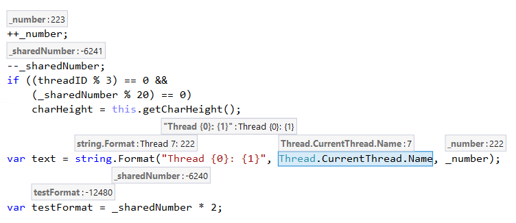
But let me tell you the whole story. As you can possibly recall the Prompts looked like this:
 So, as naive as I was, I started with creating some PNG’s. This one was the very first:
 But then… “Maybe try with a full border?”, “And what about the background?”, “Did you try a different color?” “Thicker border?” “Padding?” “Margin?” “Without border?”, etc. But the wise words where from Kamil Kupcewicz – “You know, you can draw a thousand of these, and in the end, none will be okay. ‘Cause all the magic happens when it MOVES.”
So I made gifs. In GIMP. For a couple of styles. And as you can probably imagine, it still was not enough. The prototyping on gif’s felt like hell. So this project kinda stopped, it took to long to implement new ideas.
A couple of days later, when I was changing margins in every frame of one of the gifs, a wild thought appeared: “It would be nice if I could add a class to elements in GIMP and, like, change all margins at the same time.” This idea stroke me like a bolt. I am a software engineer by trade. I know my ways around CSS, HTML, and JavaScript.
 Captain Jean-Luc Picard from Star Trek the Next Generation, episode “Deja Q.”
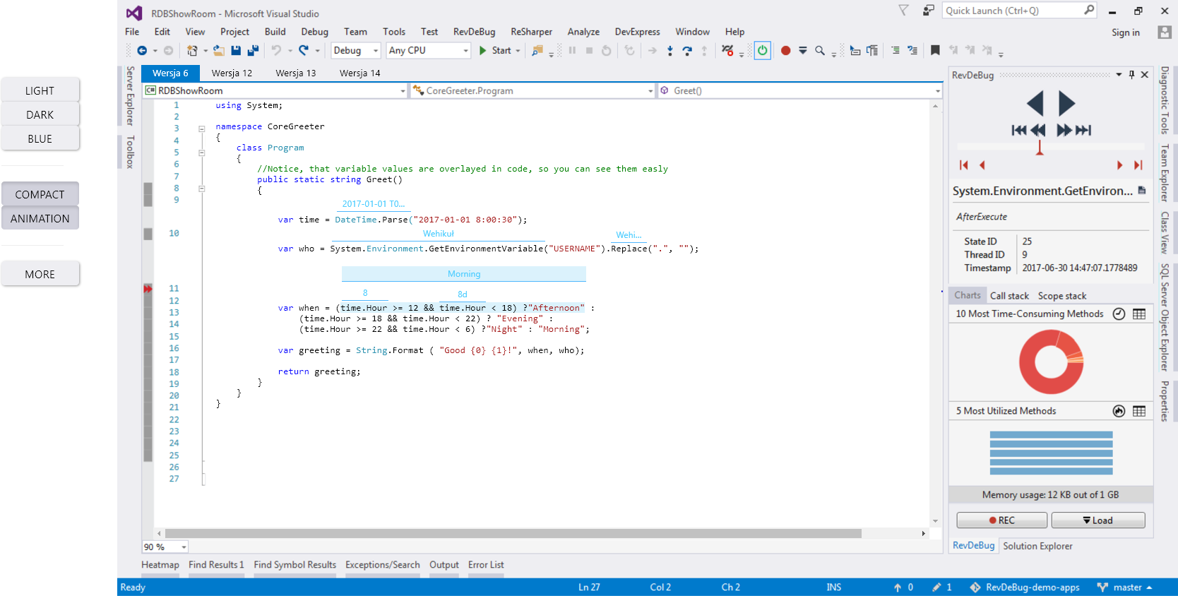
So I created a web version of how RevDeBug looks, that allows to click on the arrows, so one can move backwards and forwards, showing and hiding hard-coded Prompts of chosen visual style. This RevDeBug demo allowed for considerable flexibility in evaluating new visual ideas. I could easily change the theme of our overlays and of Visual Studio, enable or disable animations, show, and hide variables’ names and more.

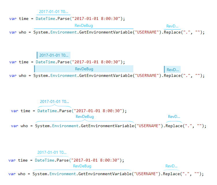
Perfect. With it creating new versions of Prompts was like snapping fingers. Therefore soon, I had fourteen different visual styles to choose from. But it was too many to show on the Guerrilla test. So I asked fellow RevDeBug developers for help. With their knowledge and sound advice, we narrowed it down to four versions, enough to not overwhelm anyone.

Now the fun began. In the next couple of days, I have conducted interviews with our potential users. And what interviews they were! I have never imagined that I would get so much feedback. The web demo of RevDeBug happened to be the best way to ask people of their opinion. It allowed them to interact with the program and get a feel of how it would be to really work with it.
The objective of interviews was to find one version of these four, to implement in RevDeBug as an only option. But the feedback I got was too diverse! One liked the fourth version and despised the first, the other hated the fourth and loved the first. Some didn’t even though about the fourth, because the third one was the best. Others suddenly unlocked versions we have hidden and decided that one of them was excellent, and we should consider it for the final version.
I had a tough decision to make as my job was to find the best one. I have analyzed all the opinions we got, And thankfully I could see the interviewees at their workstations and how their environments looked like. And they all were different. This factor has given so much to the final outcome!
Speaking with all these software engineers showed me how good GUI is essential to them for comfortable work, and diversity of answers has proven, that personalization to some extent is badly needed. In the newest version of RevDeBug (2.5.0.0), we have included the first batch of visual changes. You can see for yourself what I have chosen as a default, but you can change the looks yourself from the Options window. With all of the feedback I got, you can anticipate more shortly.
And if you won’t find the style you are looking for reach me out at contact@revdebug.com
Stay tuned, so you won’t miss on next UI improvements!
Our most popular articles:
- Azure Functions: Overview and Common Use Cases
- How to enable error reporting and monitoring for Azure Functions
Our Linkedin profile: